
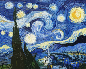
It is completely normal to notice a slight difference in color between your original digital photo and the final Paint by Numbers canvas. Turning a photograph into a physical painting is an artistic translation, not an exact HD photocopy.
If you notice some colors aren't a 100% perfect match, here is why this happens and why it is actually a good thing:
1. Screens vs. Real Paint (RGB vs. Pigments)
Your smartphone or computer screen is backlit and uses millions of tiny light pixels (RGB) to create incredibly bright and vibrant images. Physical acrylic paint, on the other hand, does not emit light. Paint relies on the lighting in your room. Therefore, physical paint will naturally look slightly darker and less "glowing" than a brightly lit digital screen.
2. Simplifying Millions of Colors
A standard digital photo contains over 16 million unique colors. To make your photo possible to paint, our advanced software must analyze those millions of colors and group them down into a manageable palette of 24, 36, or 48 distinct paint colors.
During this color-reduction process, the software averages out similar shades. This means a perfectly smooth digital color gradient (like a sunset) will be converted into separate, solid blocks of paint.
3. Shadows and "Weird" Color Spots
This is the most common surprise for beginners, especially with photos of faces! You might look at your canvas and think, "Why is there a dark green or purple spot on my cheek?!"
This happens because the software reads the exact lighting of your photo. If there is a shadow cast by a tree or a dim room, the software might interpret that shadow as a dark brown, purple, or green. Trust the process. Do not try to change the color. Once the surrounding colors are painted, that "weird" spot will look like a perfectly natural shadow.
4. The "Step Back" Effect (Impressionist Art)
Paint by Numbers is a form of impressionist art. If you stare at the canvas from 5 inches away while painting, it will look like a chaotic jumble of colored shapes.
The Magic Trick: Place your finished painting against the wall and step back 3 to 6 feet (1 to 2 meters). From this distance, your eyes will naturally blend the blocks of color together, and the image will look incredibly realistic and true to your original photo!
💡 Tip for Future Orders: To get the most accurate colors, always upload a high-resolution photo taken in bright, natural, and even daylight. Avoid photos with heavy Instagram filters, dark shadows, or yellow indoor lighting, as the software will turn those filters into paint colors!